…Katharine Morling

Cut 2Stitched up Katharine Morling_2

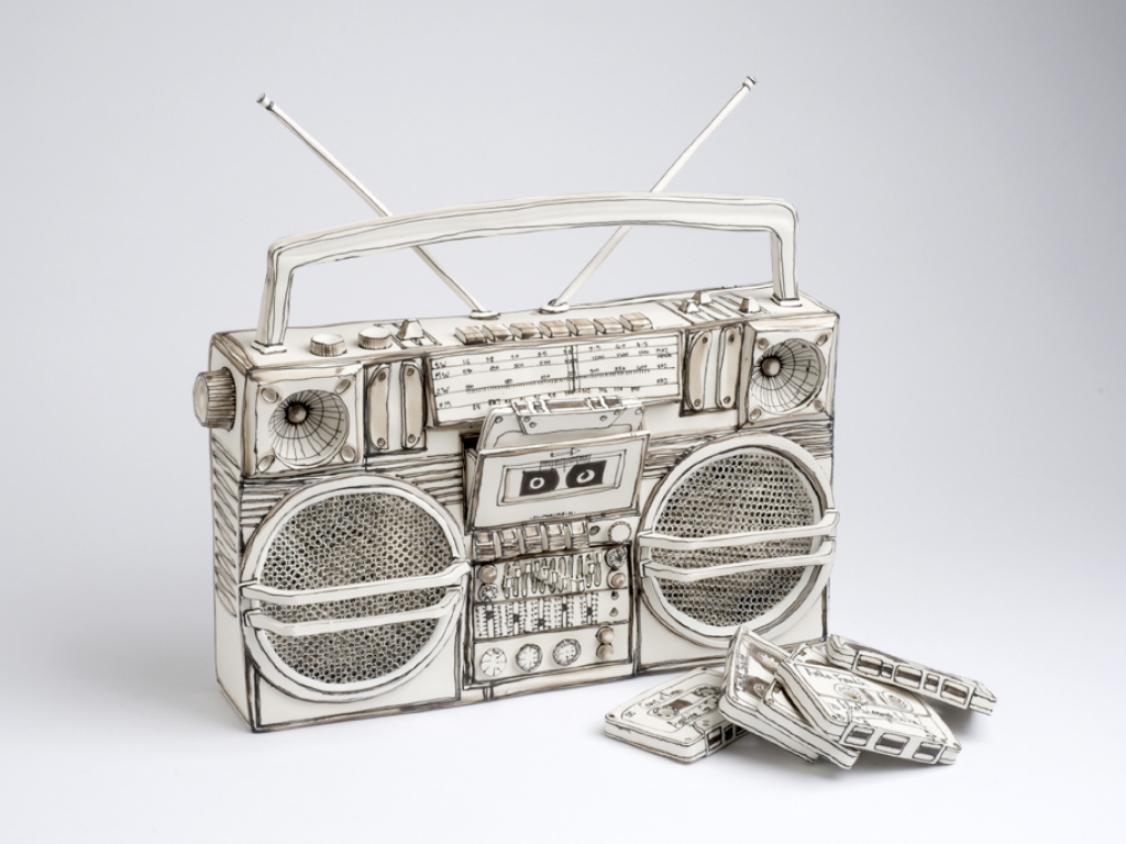
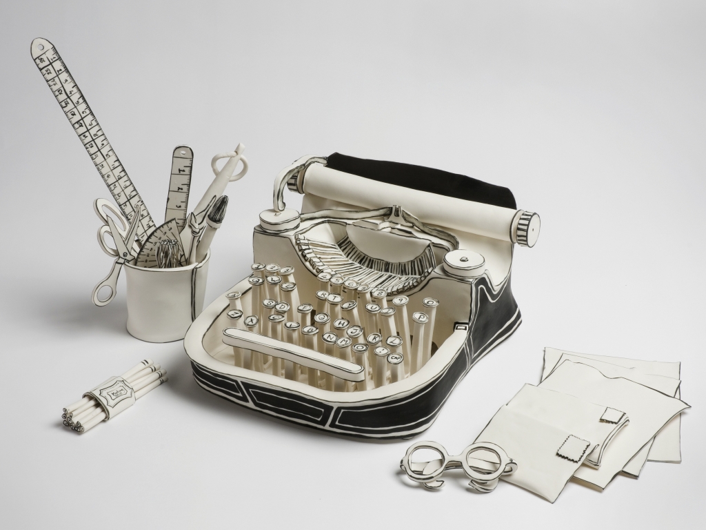
I feel like Katharine’s work is quickly becoming some of my favourite! The way the media is so disguised makes you want to look at any of her work for ages just capturing what it means to you. She uses ceramics and paints them to bring to life their still life aspects.

I think she manages to create a huge amount of movement in the pieces even though they are just still and sitting there.

My work can be described as 3 dimensional drawings, in the medium of ceramics. Each piece, on the surface, an inanimate object, has been given layers of emotion and embedded with stories, which are open for interpretation in the viewer’s mind.

KATHARINE MORLING0017-72dpi _2 Matches -KATHARINE MORLING 300

‘Matches’ is my favourite piece here I think as it is quite a simple form but the movement is portrayed so well, in my opinion, and this makes it really interesting to ‘watch’…

poison pen Katharine Morlingsmaller

…Peony Yip

PEONY YIP

Wow…I recently stumbled upon Peony’s work whilst wasting time and perusing Pinterest and it was definitely worth the procrastination to find this collection!

Her skill to capture both images simultaneously in such precise and lifelike detail without highlighting each in an unbalanced way is, in my eyes, an astounding achievement.

I can’t really think of much else to say about her work other than to explain my love for her immense yet subtle detail in all of her drawings! Her series with the red animals are ridiculously well drawn and I think you could attach a very interesting concept to them all in turn.

I’ll stop rambling now and let you take a look at her A-M-A-Z-I-N-G illustrations;

6eff798cafec545e202c3b122322088e 1602d-peony-yip_web12 4638512_orig 9085576_orig d64bc_peony-yip-animal-illustration-1-600x421_ peony yip 8[4] peony_yip_04 PEONY-YIP-26

…Jee Young Lee

JEE YOUNG LEE

I love this young artists work! I think it is so inspiring the way that she transformed her tiny studio – 3.6m x 4.1m x 2.4m – into so many different unique dreamscapes letting her only boundary be the edge of her imagination (an edge that I’m sure she does not possess!). Lee comes from Seoul in Korea and has made a series of these scapes ready to capture with a single photograph while using no altering computer software…

Due to the way that the small space is so filled up with every different theme it allows you to lose yourself within the image – even more amazing if you were really standing there in her studio! I think that is one of the main reasons why I love her work so much…my favourite art is art that you can get lost in whether that be literally or just when you let your mind get wrapped up in thoughts about it.

E

She has made so many of these different  scapes and I love them all so much I want to put most of them in this post so happy scrolling!

556816 birthday_120x96cm_Inkjetprint_2009 jeeyoung_lee_opiom_gallery_314 Jeeyoung-Lee JeeYoungLee_03 Jee-Young-Lee5 Jee-Young-Lee-12 lee-2 lee-3 lee-4 lee-5 lee-6 lee-7 lee-8-new lee-9 lee-10 ressurection slide-328758-3201689-free tumblr_ni3hjm30Vw1qzfsnio7_1280

…Week Twelve…Nigel Coates

NIGEL COATES

I think his installation is very relevant. People of the world today definitely need to start opening their eyes, to the very near future of our cities, and start learning about the issues so that we can have some chance to stop these issues becoming even worse and ultimately unsolvable.

I think in a choice between simplistic or complex, I prefer something to be more down the simpler end with regard to design so the look of his artwork does not look that good to my eye but I agree with his reasons for creating all of the different aspects of the overall piece.

I believe that all architecture should have a percentage, as it were, of art content; not some ghastly sculpture stuck in front of it. That there should be an aspect of what architecture communicates which is artful and sensitive…

…Week Twelve…Bob and Roberta Smith

BOB AND ROBERTA SMITH

I definitely think that the slogans here are only impacting to the viewer if you know the story behind it – particularly the one ‘When Donald Judd comes to our place’.

I found the video quite boring to be honest even though I actually am interested in typography and sign painting sort of like this kind of thing. The colours are bright and eye-catching even if what it says doesn’t immediately grab your attention. What he is saying about slogans overall and how they can mean different things, and how perhaps we should think about what we are saying in relation to that, is thought-provoking which perhaps partially makes up for the lack of interest in his painted signs.

…Week Eleven…’1000 People Screaming at the Tate’

PAOLA PIVI

Honestly I don’t think this should be classed as ‘art’. It’s an interesting idea but not something to put alongside the likes of other artists’ work. I like the way that it fills the confined space – the noise of it, but I don’t see why anyone would make the effort to travel all the way to the Tate to scream for a couple of minutes. It’s more alike to some sort of odd social experiment than any art installation but I guess the one thing that I like is that you are involved in the exhibition of the art itself – I definitely prefer it when your involvement is not what the whole thing consists of though.

Having said all of that, I do see how the concept is interesting – how it is one solid noise made up of the individual noise from each individual person there. It links everyone together no matter how far they have come from or what background they have.

…Week Eleven…’Street Art’

STREET ART

I cannot help but feel this is completely defeating the point of street art and its spontaneous, unplanned nature. For it to have been planned by the gallery kind of ruined it for me. Part of street art is for it to have a side of rebellion to it and you never know what you will find or where you will find it but this is all planned out and consented and has none of that spirit to it. I don’t even really like any of the actual work of this group of artists except for the use of colour in the first one.

…Week Ten…Quentin Blake

QUENTIN BLAKE

I am instantly thrown back to my childhood, curled up in my duvet on my bed reading a Roald Dahl book. Quentin Blake is known for his illustrations for the popular children’s author, with their extremely skilled but haphazard and highly unique style. There is so much detail when you look closely at the images, and this is brilliant for curious children and it always used to make the story itself jump off the page and dance, becoming alive, in front of your eyes!

I want everything I do to look spontaneous. It’s not that I think illustration should necessarily be like that, but this is what I can do.

Dahl-Blake_It_was_a_big_bottleblake-banner-bigRD7001 - Roald Dahl - Matilda - This child seems to be interested in everything - Limited Edition Print - Quentin Blake Print - Matilda Signed Printpelican

His technique is to use different speeds of his pen to create the movement and his media is predominantly watercolour and black pen – simple yet very impacting. Using the watercolour he captures the raw energy of the image and I am a big fan of how he is producing his work in the book ‘Beyond the page’ for it to be used also in hospitals and museums. This brings to a new audience again his fantastic work of illustration.

…Week Ten…’Staircase – III’

DO HO SUH

Alike to the artist here, transitional spaces also attract my attention so this project is really interesting to me. The way that it has been constructed from material and suspended means it is moveable and again I like the idea of how it does not need to always be in one place.

It’s really engages the viewer by letting them imagine where they could be in relation to this suspended structure. You can let your imagination unfold as to where the staircase could be, who uses it, which rooms are attached above and below………

Do Ho Suh was born in Korea and moved to live and work in New York and London. He has created other installments such as ‘home within home’ and also a new york apartment series…

1054 do-ho-suh-home-within-a-home-at-MMCA-designboom-05 do-ho-suh-finishes-transparent-new-york-apartment-in-color-designboom-04do-ho-suh-finishes-transparent-new-york-apartment-in-color-designboom-03

…Week Nine…Antony Gormley

ANTONY GORMLEY

I really like his conceptual ideas for his projects shown here. I don’t like at all the blocky sculptures but I think the metal ones with the ‘visible void’ where the person would be but isn’t are actually very pleasing to look at. You can make an image up out of all different angles that you look at it from and it is different from other metal work too.

I feel like there isn’t much to analyse here as the artwork is what it is to you when you look at it and, much like all other art, the viewer brings a certain amount of meaning to the artwork personally themselves.